Background
Managing HVAC equipment
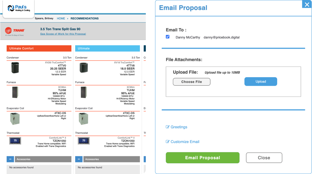
John, the owner of Pricebook Digital, reached out to us with the goal of enhancing the user experience existing applications for dealers, distributors, and clients. These applications facilitate the creation of HVAC equipment offers, while Pricebook Digital offers a comprehensive solution for equipment data management, time-saving tools, and a platform for sales growth.
The company manages all HVAC equipment data, ensuring up-to-date information on certified systems, rebates, finance plans, and more, simplifying the process for their clients.
Challenge
Three apps, one cohesive system
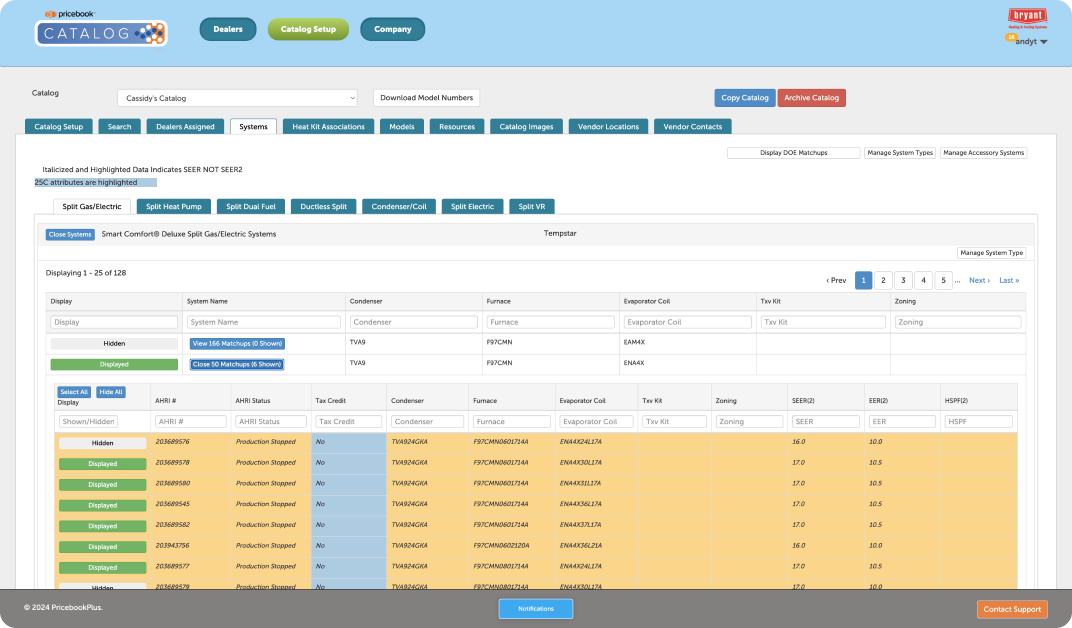
Embarking on a mission to rejuvenate Pricebook Digital's trio of applications (Distributor, Dealer, Client), we faced a complex array of challenges:
Diverse user needs
Each application, designed for different user groups, lacked cohesion in functionality across various devices.
Complex application architecture
The underlying architecture was disorganized, posing challenges in implementing new functionalities.
Cluttered information display
Complex views were overloaded with information, leading to user overload and confusion.
Inefficient search and filtering
Essential tools like global search and effective content filtering were absent, hindering user efficiency.
Confusing messaging
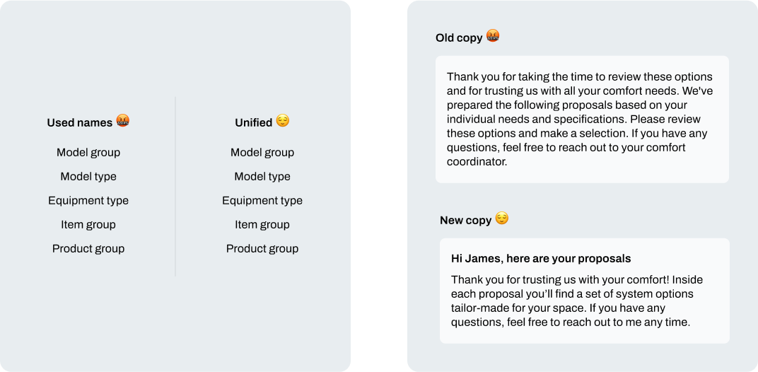
The language and messaging used were overly formal and varied, causing confusion with inconsistent terminology.
Technology restrictions
We were tasked to focus on changes that would not require extensive backend work by developers.
Research
Unpacking apps together
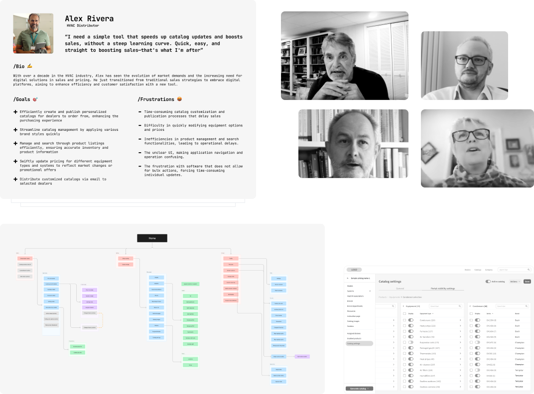
Diving into the apps with everyone involved was quite the adventure, since finding someone who knew the ins and outs of every feature was like looking for a needle in a haystack. We didn't stop there, though; we also got in touch with dealers, distributors, and folks who use Pricebook apps day in, day out to get the full scoop.
Customer interviews / Prototype testing / Customer journey / User personas /Information architecture
Building blocks
A flexible & future-ready system
Once we had a visual direction it was time to chart out the core building blocks. The system had to be modular in order to ensure future growth potential and scalability. Unlike building a house, a digital product requires simultaneous design of functionality and its supporting building blocks. By revisiting this process throughout the course of the project, we ended up with a robust, scalable design system expressed in a consistent visual language.

Branded themes with tokens ❤️
To cater to our client's need for white labeling, we embraced the power of Tokens (AKA variables), a staple in development, now making waves in design. We applied this concept to our color palette, creating a dynamic system that accepts basic hue values and generates a comprehensive palette. This approach is invaluable during development handoffs, simplifying change management. It also enables us to perform some neat design tricks, enhancing brand adaptability and ensuring our designs meet diverse brand requirements with ease.
Solutions
The evolution of Pricebook into a unified software suite
Each application served unique user personas, each with distinct needs. Let’s take a look at some of the quality-of-life improvements that we implemented across the Distributor, Dealer, and Client apps.

Seamless navigation meets future-ready architecture
Diving deep into our trio of apps, we've dialed up their architecture and navigation to be slicker and more intuitive. Imagine this: crystal-clear pathways and a setup so flexible, future features slide in with zero fuss. Plus, we sprinkled in breadcrumbs to make navigating complex screens a breeze. It’s all about making life easier, ensuring our digital spaces grow without hiccups and keeping everything user-friendly. This revamp is our way of saying goodbye to the old clutter and hello to smooth sailing ahead.
Finding data just got easier
We've dialed up the user experience in our app's latest update by introducing a global search. Before, wading through oceans of data felt like a chore, but not anymore. Now, our intuitive search as well as robust filtering and sorting options make finding exactly what you're after as easy as pie.
Clearer copy, better UX
Refining the UI copy was key, aiming for clarity with fewer words. We avoided jargon and technical terms to keep things user-friendly. Also, we standardized element names to prevent confusion, ensuring a smooth and accessible app experience.
Enhancements for smoother sales
Since our three apps are centered on boosting sales, we've injected a suite of enhancements to streamline the search for optimal solutions. This fine-tuning aims to match users with the perfect options,
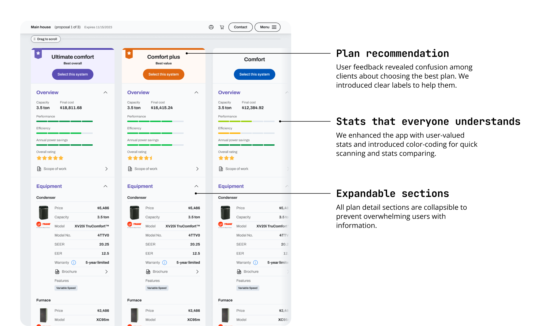
Adding smart upsell
Recent research shows that 88% of salespeople aim to upsell customers. We've integrated upsell options across the app to align with this trend.
Outcome
HVAC management made easy
As a result, we developed three applications that utilize the same components, enhancing the selection of HVAC systems and creating product offers. Our solutions provide clients with a system tailored to display complex data clearly, ready for future features, and assisting buyers in making informed decisions without the headache.
