
Background
Asset management in your pocket
IBM Maximo is a complex and nuanced product that has amassed a huge user base. This advanced asset management platform is a web-first product, but in today’s mobile world, technicians need a way to bring it with them out into the field. The EAM360 Technician app packs the powerful features of Maximo into a compact size, streamlining the asset management process from top to bottom.
Challenge
Anything but a blank slate
The old Technician app was split into two apps — one for iOS, and one for Android. We realized early on that we could improve user experience while reducing maintenance costs and feature development time by unifying the app under one design system and shared set of components.
We also knew that any new designs had to work within a tight set of constraints: All existing app features needed to be maintained and/or improved to meet the expectations of existing users All UX needed to fit the mental model of Maximo users who may be new to the app Everything needed to fit within the capabilities of the Maximo API
Our final goal with the system was to design it such that the developers could adapt to changes or new Maximo features without necessarily needing to involve designers at every step.
Old applications
Android
iOS
Exploration
Learn before doing
As with most projects, the first step was to do a deep dive on the subject matter at hand. This is always a balance between acquiring the necessary information to empathize with user needs, but not becoming so accustomed to the norms of the existing products that we lose the valuable insights of a beginner’s mind.
We spent time testing both the existing EAM360 app as well as the IBM Maximo web app on desktop to gain familiarity and identify pain points. We found issues with navigation and user workflows that were ripe for improvement. We also realized that any new views we created would have to be extremely flexible in order to accommodate both user customization and new app features.
Competitive analysis
Learning from others’ mistakes
Of course EAM360 isn’t the only app taking a crack at this problem. We took inventory of competing apps and their respective comment sections on the iOS and Android app stores to see what we could learn about common user frustrations.

Key takeaways
Stability issues, app performance, problems with navigation, and spotty coverage for search and filter capabilities were all common problems across the board. Knowing these pain points helped to set objectives for the work ahead.
User persona

“I need a mobile app that's easy to use and always reliable. It helps me stay on top of my game and keep my clients' assets up and running”
/Bio ✍️
Michael is a 30-year-old Field Service Engineer in New York, skilled in troubleshooting and problem-solving. He has extensive experience in repairing and maintaining various equipment but faces challenges with the Mobile EAM app, despite being committed to providing the best possible service to his clients.
/Goals 🎯
Easily track time spent on each task
Receive clear and concise directions to the asset he needs to fix
Perform inspections and capture detailed data on asset condition
Ensure that all necessary tools and materials are available for each task
Minimize time spent searching for parts
/Frustrations 🤬
Struggles to navigate the Mobile EAM app with one hand, as he often needs to hold tools or equipment in the other hand while using the app.
Has difficulty navigating to the repair point and switching between different assets
Lack of access to the necessary tools and materials, leading to incomplete or delayed repairs
Limited availability of relevant information
Inefficient use of time due to difficulties in locating assets and parts
Building blocks
A flexible & future-ready system
Once we had a visual direction it was time to chart out the core building blocks. The system had to be modular in order to ensure future growth potential and scalability. Unlike building a house, a digital product requires simultaneous design of functionality and its supporting building blocks. By revisiting this process throughout the course of the project, we ended up with a robust, scalable design system expressed in a consistent visual language.
Tokens ❤️
Tokens (AKA variables) are an indispensable tool in the dev world, and we’re just now starting to see them creep into design. We applied this methodology to our color palette to create a truly flexible system that takes a simple set of hue values as input, and generates a full color palette that we can tune, refine, and adapt as needed. This has been a huge help in the development handoff process, especially when it comes to managing changes. It also lets us pull off another cool trick. More on that later.
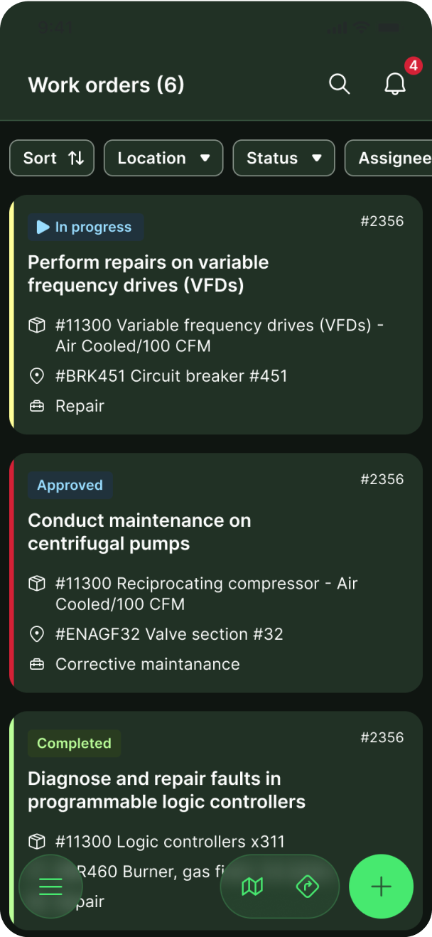
One card, hundreds of possibilities
The app makes heavy use of cards to display all kinds of information. Creating each card in a bespoke way would a monumental and tedious task, both for design and dev. Instead, we created a reusable set of components that slot into any card as needed.
Multi-device ready
We knew from the start that this app would be used across both phones and tablets. We prepared for this by creating layouts that could be directly reused on both devices, drastically reducing development time.
Solutions
Making technician life easier
Let’s take a quick tour of some of the many new and improved screens in the app.
Navigation tailored to the user's needs
Before 🤬
Let’s be real—this is a hot mess. Beyond the sheer visual noise, it’s completely un-scalable, and unclear where new elements should be added. This caused all kinds of of problems every time a new feature needed to be added in the past.
After 😌
We analyzed the entire information architecture and decided to nest all links inside a FAB (Floating Action Button), moving it to the bottom of the screen for easier access. We also added breadcrumbs to improve navigation on more complex screens.
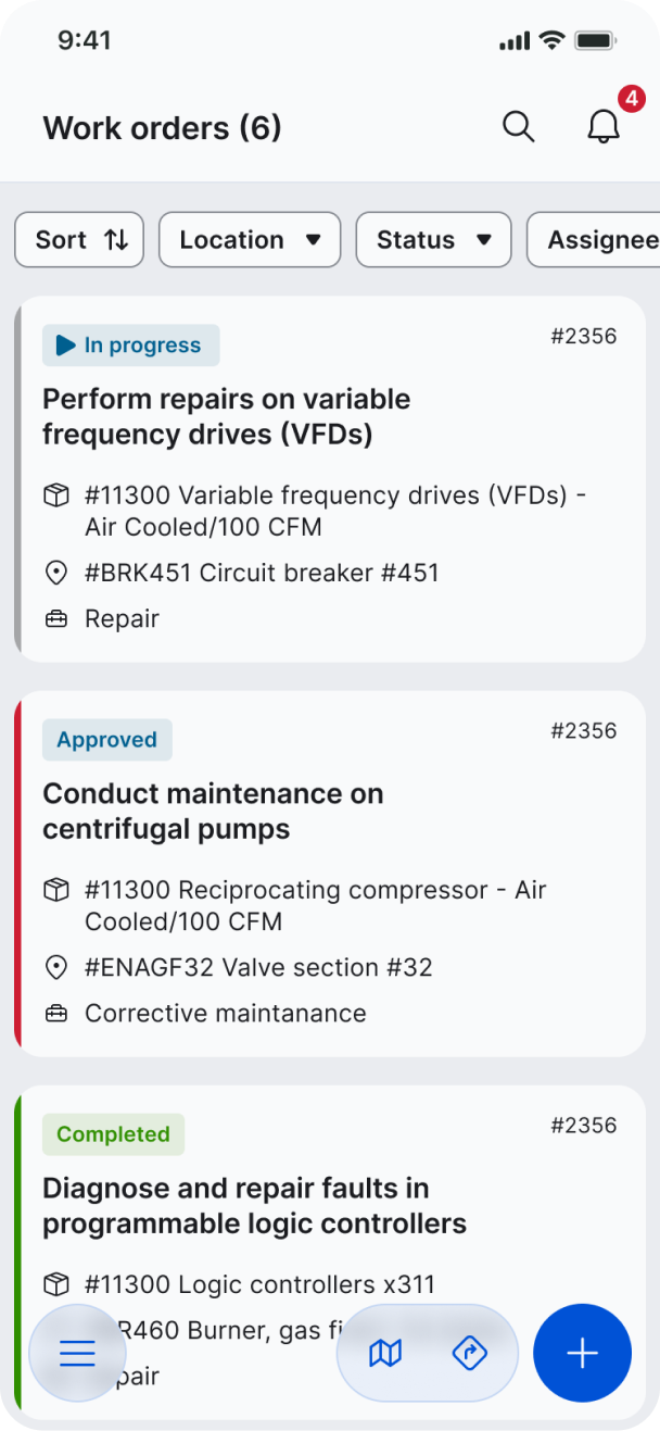
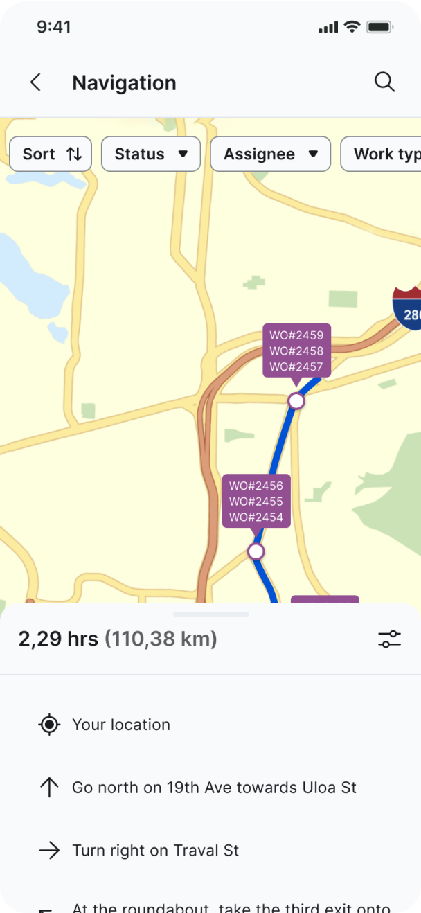
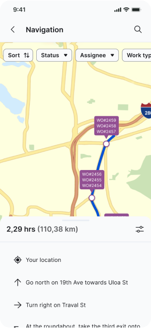
Global search, consistent filters
With the vast amounts of data in the app, quality global search was always going to be table stakes. Tapping through menus with such a complex hierarchy was never going to cut it alone.
When users do find what they’re looking for, it’s important to provide them with a consistent filtering experience, regardless of the type of data they’re working with.
This one-two punch of getting to the right place quickly, then narrowing down the data is flexible navigation experience that users can rely on.
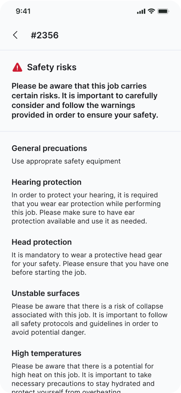
Work order details
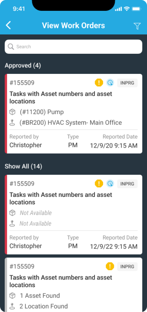
Before 🤬
Let’s be real—this is a hot mess. Beyond the sheer visual noise, it’s completely un-scalable. Stacking information horizontally on a small screen like this is almost always a recipe for running out of space. What you’re not seeing here is all of the common user actions that are hidden or simply unavailable. To the trash with it!
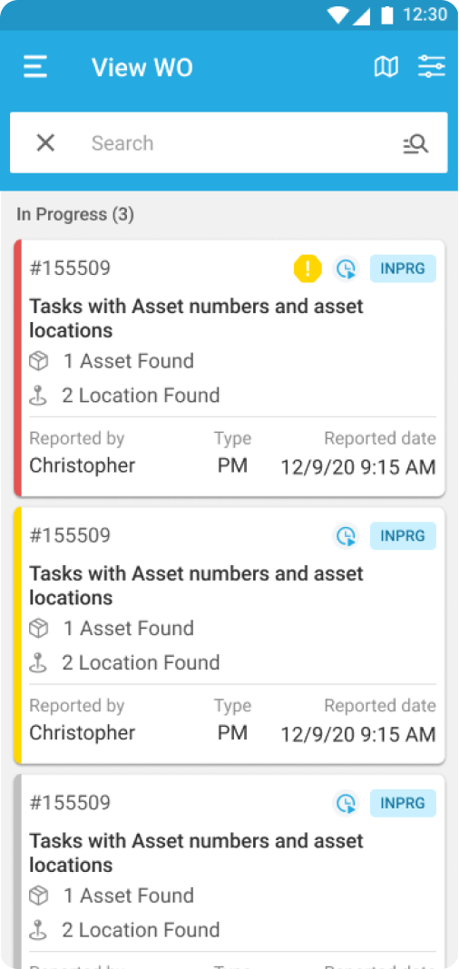
After 😌
To improve the UX of this screen, we implemented a dynamic row component that always takes up the full width of the card. We also nested important actions under an icon, such as quickly contacting a team member or showing the route to related assets, which were previously buried deep within menu mayhem.

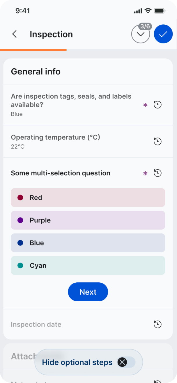
Flexible inspection flow
We redesigned the inspection flow with efficiency in mind. The app allows techs to conduct inspections based on predefined plans and add notes, photos, and other relevant information to inspection records.
Before 🤬
The inspection screen had an overwhelming number of fields all shown at once, leading to endless scrolling. Additionally, crucial information about the inspection progress was located at the top of the screen, causing further scrolling issues.
After 😌
We completely rebuilt the inspection flow with an eye on reducing the amount of taps needed, and surfacing only the relevant information at any given time.
Prioritizing accessibility
During our research, we found that technicians typically operate the app with one hand. To accommodate this, we made sure that all important functions are within the thumb zone. We increased the size of tappable areas wherever possible, and verified the contrast ratio of all elements to ensure that they met accessibility standards, not to mention being visible outdoors in bright sunlight.
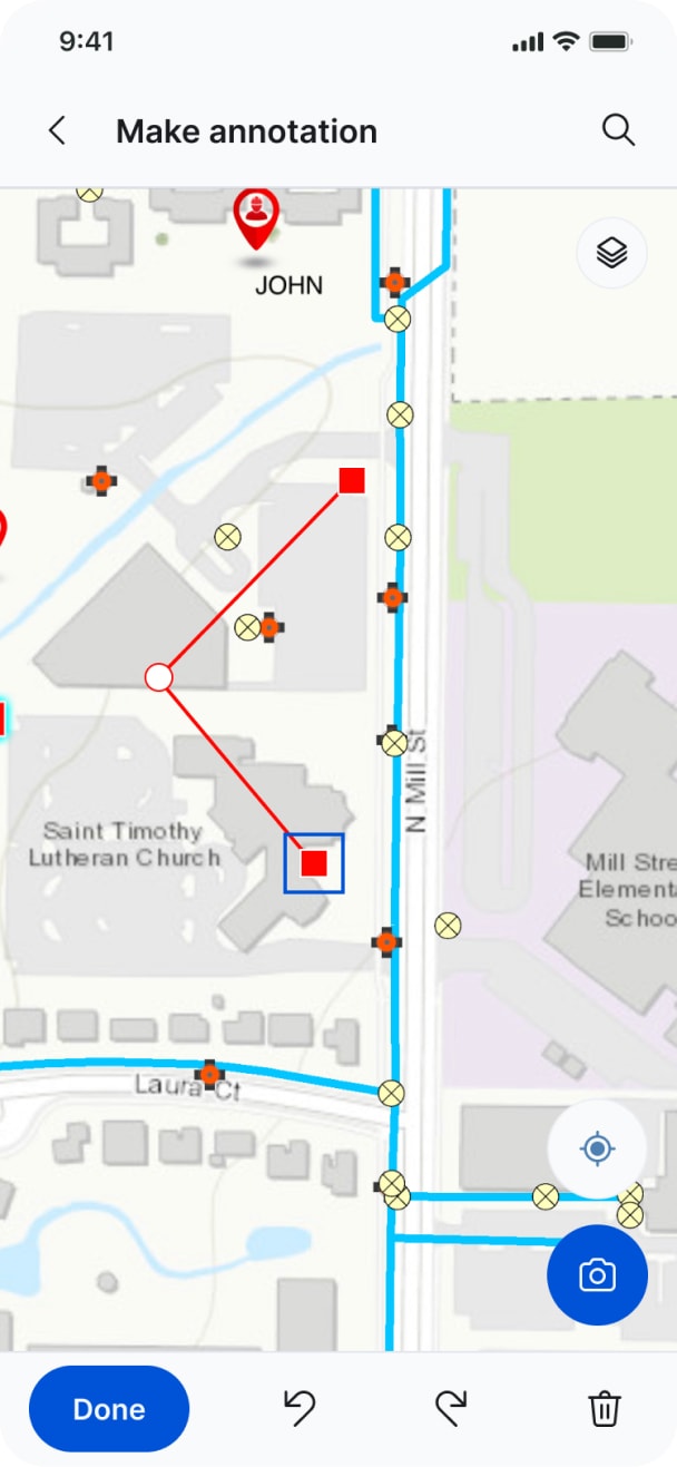
...and other UX improvements
Outcome
Time savings all around
The new single, cohesive version of the EAM360 Technician app can be easily implemented on both iOS and Android systems. Our design approach ensured that the app would be flexible and adaptable to future changes, leading to significant savings in both development and maintenance costs.
The resulting app is also sure to save countless hours of technician’s time and energy, not to mention their patience and peace of mind.
