
Background
The creator economy
Instagram, TikTok, and YouTube are fantastic places to build an audience, but creators who do quickly discover that they have relatively limited options on those platforms when it comes to monetizing the following they’ve built.
Routinr is a place where creators can share and monetize the daily routines that helped them become who they are. These routines can be anything from workouts to meal plans, skincare to business productivity, and everything in between. This model puts creators in control, and gives audiences a more meaningful and interactive way to engage with creators they love.
Brief
The heart of the issue
We were brought in to address a glaring problem. The existing routine creation flow was practically unusable, leading to a horrendous drop-off rate and creators not returning to the platform. This was obviously a problem, since you can’t have a product that sells routines to users if there aren’t any routines available.
Exploration
This ain’t working
Reusability and modularity are non-negotiable features of our process. We design and build with an atomic design approach. Just like the world around us can be progressively broken down into repeated molecules and atoms, all interfaces can and should be composed with well-defined reusable components. Thus ensuring future growth potential, scalability, and consistency.
Building blocks
Atomic!
Once we had a visual direction it was time to chart out the core building blocks. The system had to be modular in order to ensure future growth potential and scalability. Unlike building a house, a digital product requires simultaneous design of functionality and its supporting building blocks. By revisiting this process throughout the course of the project, we ended up with a robust, scalable design system expressed in a consistent visual language.
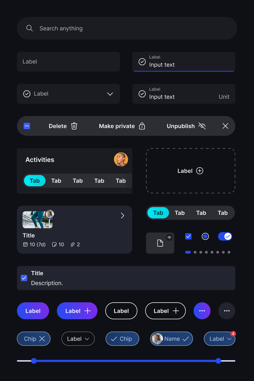
Tokens ♥
Tokens (AKA variables) are an indispensable tool in the dev world, and we’re just now starting to see them creep into design. We applied this methodology to our color palette to create a truly flexible system that takes a simple set of hue values as input, and generates a full color palette that we can tune, refine, and adapt as needed. This has been a huge help in the development handoff process, especially when it comes to managing changes. It also lets us pull off another cool trick. More on that later.
Stealing colors
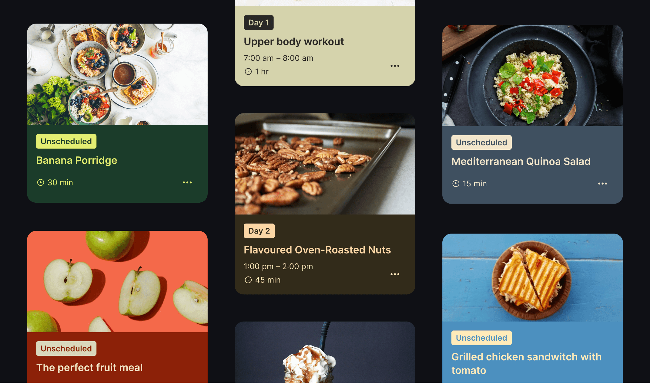
We’re always on the lookout for hierarchy and content differentiation. Getting these right helps new and veteran users alike accurately digest what’s on screen. Our system automatically grabs colors from activity thumbnail images, and uses the resulting palette to individually theme the cards. This helps set activity cards apart from other content, and it also looks pretty cool if we may say so ourselves…
Expansion
Flexibility in motion
Sometimes we sound like a broken record going on about how important a flexible foundation is. Well look no further than this project to see why. Remember how at the beginning our job was just to rescue the existing routine creation flow? After we succeeded there, the founders came to us with their phase 2 vision ahead of schedule: A major upgrade to the activity system that would unlock a whole range of awesome features that weren't previously possible.
Technically speaking this only changed one part of the system, but it rippled through the rest of the product in a big way. Having a flexible system in place allowed us to quickly prototype multiple ideas. We actually ended up with a solution that neither us nor the founders expected going in. Only doing the work and iterating through the process in an efficient way allowed us to get there.
Change begets change
The phase 2 upgrade went way beyond the creator side of the platform. It also meant rolling up our sleeves and digging into the as yet untouched user side of things. This restructuring left almost no page untouched, and it gave us the opportunity to apply the new design system to more areas. The product that emerged in the end is sure to be more useful and worthwhile to creators and users alike. It’s also a more confident, modern, and consistent representation of the brand as a whole.
Solutions
Giving the creators some love
As we mentioned before, you can’t have a marketplace if it’s got nothing on offer. Let’s take a look at some of the quality-of-life improvements that creators got out of this deal.
Calendars. They’re great!
The original routine creaton flow was essentially a list of activities. That might have been okay except for the fact that it was actively hostile to use, and people were reliably abandoning it before finishing their routines.
We completely overhauled this system and gave people what they’re used to: a calendar! The new system does all the things you’d expect. Dragging activities onto the grid view from the library, picking up and moving things, batch deleting, setting activities to repeat, changing the start and end points of a routine, and more. All a breeze with the system.
Creating with confidence
The calendar is only one part of the routine-building process. Creators also have to add titles, tags, descriptions, media, and more. Whether you go straight through or bounce all over the place, everything is handled smoothly with confirmation at every step that the work is saved.
Content in the bank
The previous system didn’t give creators any way to save activities or see all of their content in one place easily. Needless to say, we weren’t cool with that! Now clicking on the aptly named “My content” lets users view, sort, filter, manage, and just generally admire their glorious work. Of course it also works just as well on mobile as it does on desktop.
Users rejoice!
Creators aren’t the only ones having a good time at this party. The user side of things also got some major attention.
Fitting right in
As you might be able to imagine, activity cards are pretty much everywhere on Routinr. The new card design looks familiar everywhere it appears, but it’s flexible enough to adapt to all situations, showing relevant information for each context across web and mobile alike.
You get a theme, you get a theme!
Remember that color token system from before? It played a key role because the brand palette changed a few times over the course of the project, and each time we were able to quickly adapt it without tearing our hair out. It also made it easy to implement the only feature people really care about when it comes to color: light and dark mode! Flipping between the two is almost as easy in the design file as it is in the developed product—just like it should be.
Home is where the index.html is (usually)
Users got a brand-new browse and search experience, starting with a refreshed and snazzy home page. Getting to the content you want is now much easier with the revised search flow that lets you pick content types on the fly.
A shiny new pack of activities
The new routine purchase flow has a little bit of fun and a whole lot of usefulness sprinkled on top. Starting with a new purchase confirmation animation, and ending with a handy way to sprinkle those new activities into your calendar.
Organization for all
Creators aren’t the only ones who need a good way to sort through their stuff. Users also get a first-class browsing experience for all their purchased content, no matter if they have 1 routine or 100.
