Background
Unified publishing ecosystem
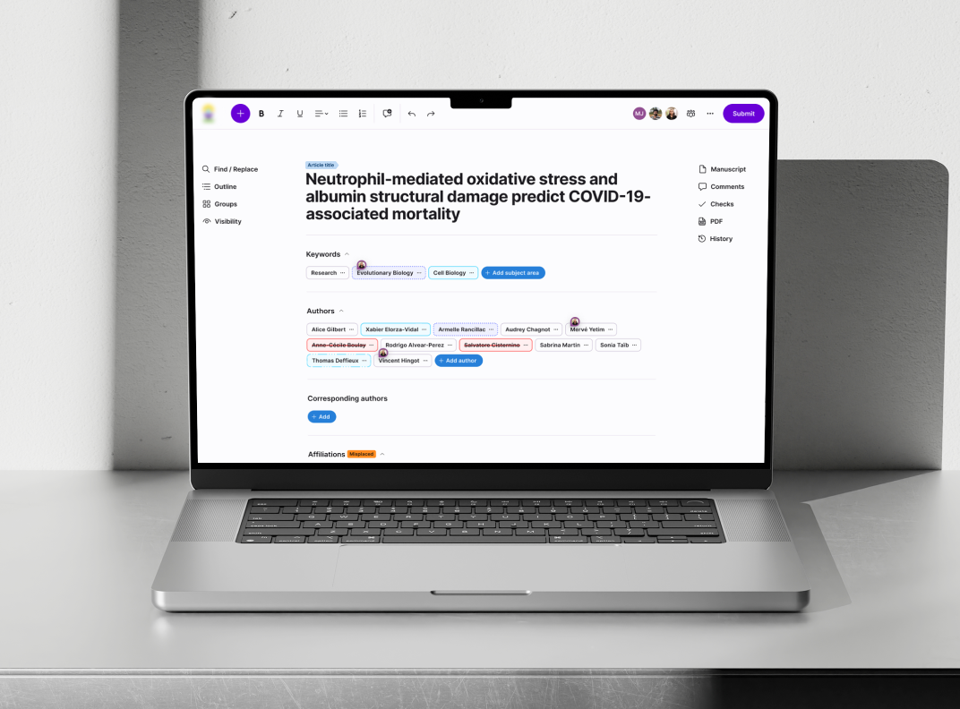
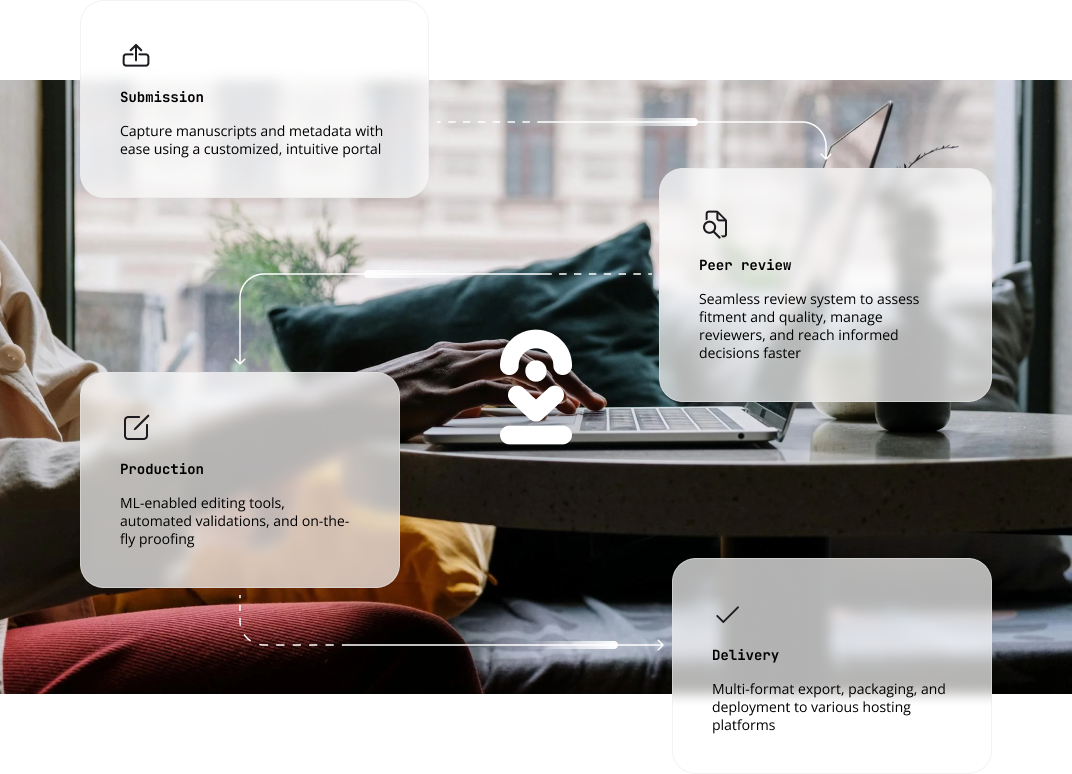
Kriyadocs is a complete publishing platform that streamlines every stage of scholarly publishing—from submission to peer review, editing, and final publication. It equips authors, editors, and reviewers with tools that boost collaboration, improve efficiency, and ensure high-quality, multi-format content.
The client approached us to redesign their user experience to better support the varied needs of publishing professionals at all stages, from initial edits to task management and approvals. Our goal was to create a seamless, flexible experience that adapts to different publisher workflows, making the entire process smoother and more efficient.
Research
Diverse publishing needs
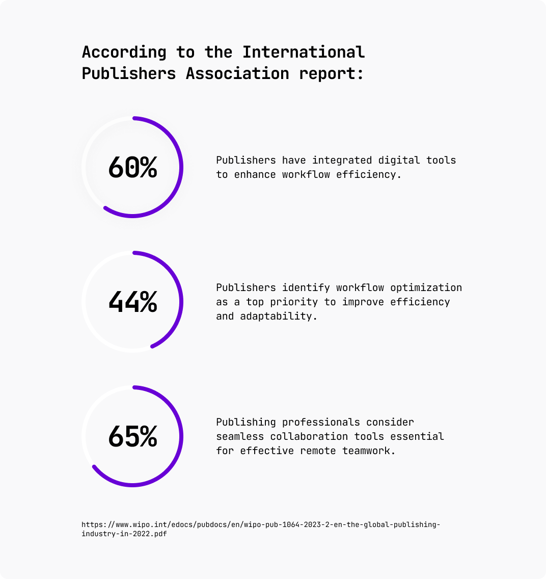
As usual, any project starts with discovery stage. Publishers' unique workflows and roles demand a flexible platform that adapts to diverse needs and enhances productivity.
Problems
Diverse publishing needs
As usual, any project starts with discovery stage. Publishers' unique workflows and roles demand a flexible platform that adapts to diverse needs and enhances productivity.

Diverse workflows
Publishers have unique workflows, with varying decision-making processes, stages, and people involved.
Sensitive information control
Essential for maintaining data security and confidentiality with complete visibility control.
Seamless review & editing
Need for smooth transitions between task updates, editing, and final publication changes.
Team collaboration
For effective task management and peer review, teams need a robust collaborative platform.
Mobile-friendly
Desktop features must be accessible on mobile for on-the-go edits.
User-friendly, advanced Editor
Editor should empower users with error detection, source validation, and submission tools, even for non-technical users.
Platform-wide accessibility
Ensuring usability for all, regardless of technical skill, for an inclusive experience.
User persona

Building blocks
Atomic!
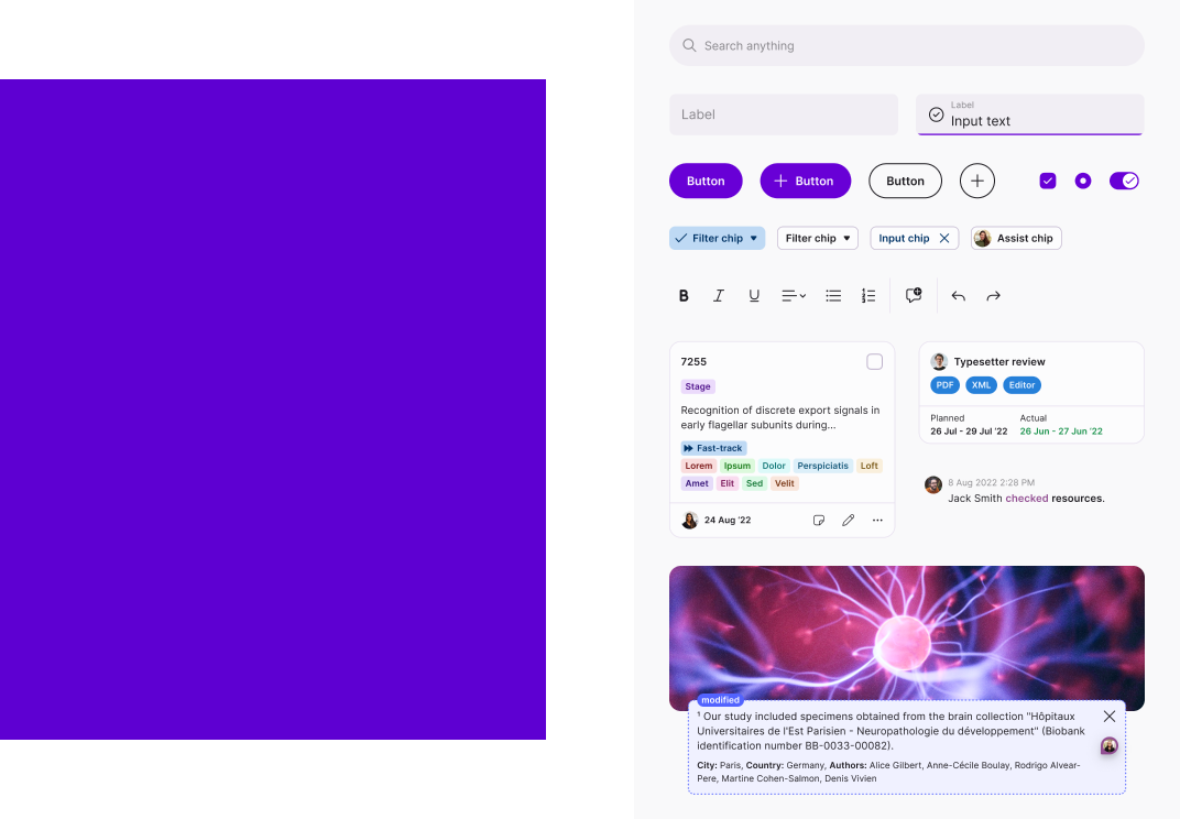
Reusability and modularity are non-negotiable features of our process. We design and build with an atomic design approach. Just like the world around us can be progressively broken down into repeated molecules and atoms, all interfaces can and should be composed with well-defined reusable components. Thus ensuring future growth potential, scalability, and consistency.
Tokens ❤️
Tokens (AKA variables) are an indispensable tool in the dev world, and we're just now starting to see them creep into design. We applied this methodology to our color palette to create a truly flexible system that takes a simple set of hue values as input, and generates a full color palette that we can tune, refine, and adapt as needed. This has been a huge help in the development handoff process, especially when it comes to managing changes. It also lets us pull off another cool trick. More on that later.
Solutions
Publish without the hassle
Let's take a quick tour of some of the many new and improved screens in the app.
Dashboard where flexibility meets personality
The old dashboard lacked flexibility, making it difficult to adapt to the needs of different publishers. Each team has its own processes, and the previous setup just wasn't cutting it. So, we revamped the dashboard, adding customizable views like a Kanban board to give users full control over their workflow display. Plus, we threw in emojis to make it easier to spot different stages at a glance, adding a bit of personality and clarity to each column.
Global search & advanced filters
With such a complex app, we knew we had to focus on findability to help users navigate smoothly and locate specific information with ease. That's why we decided a global search was a must-have. It lets users search for any term in titles, descriptions, and even within the document text itself.
We also upgraded the content filtering options, adding a layer of personalization by allowing users to save and create their own custom filter templates.
Advanced editor
With such a complex app, we knew we had to focus on findability to help users navigate smoothly and locate specific information with ease. That's why we decided a global search was a must-have. It lets users search for any term in titles, descriptions, and even within the document text itself.
We also upgraded the content filtering options, adding a layer of personalization by allowing users to save and create their own custom filter templates.
Collaboration in full flow
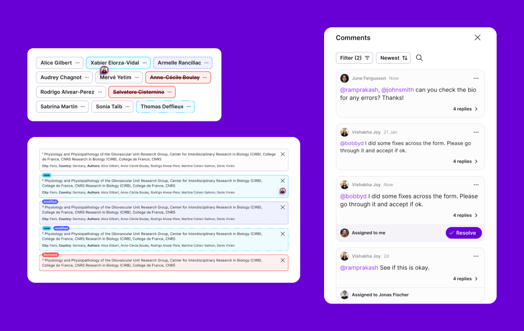
During our research, we realized we needed to give extra attention to improving user collaboration. Users need to know which parts of an article are new, modified, or removed. The old version relied solely on color coding for these updates. So, we introduced different types of outlines and highlights to distinguish between new, modified, and removed content.
On top of that, we gave users the freedom to leave comments and added a changelog feature to track all changes, making collaboration clearer and more efficient.
Improving navigation
During testing, we found that navigating through complex, lengthy documents was a hassle. To solve this, we added an "Outline" panel, giving users a clear overview of all publication sections. This panel allows them to quickly jump between sections, view recent changes in each chapter, and see comments from other team members—all in one place.
Editing on the go
Authors often need to make last-minute changes or work under tight deadlines. This requires the flexibility to edit from anywhere, on any device. By using flexible components and a modular approach, we were able to bring the full desktop experience to mobile devices without any compromises.
Outcome
Kriyadocs, now smoother and smarter
The new Kriyadocs platform has simplified publishing workflows, making it easier for teams to work together and stay organized. With improved navigation, better collaboration tools, and a design that works seamlessly across devices, users can now focus on what matters without getting bogged down by the details. Kriyadocs is now more intuitive, efficient, and aligned with the real needs of publishing professionals.
