Brief
We joined hands with Hotstar in augmenting their team to build their next generation mobile experience
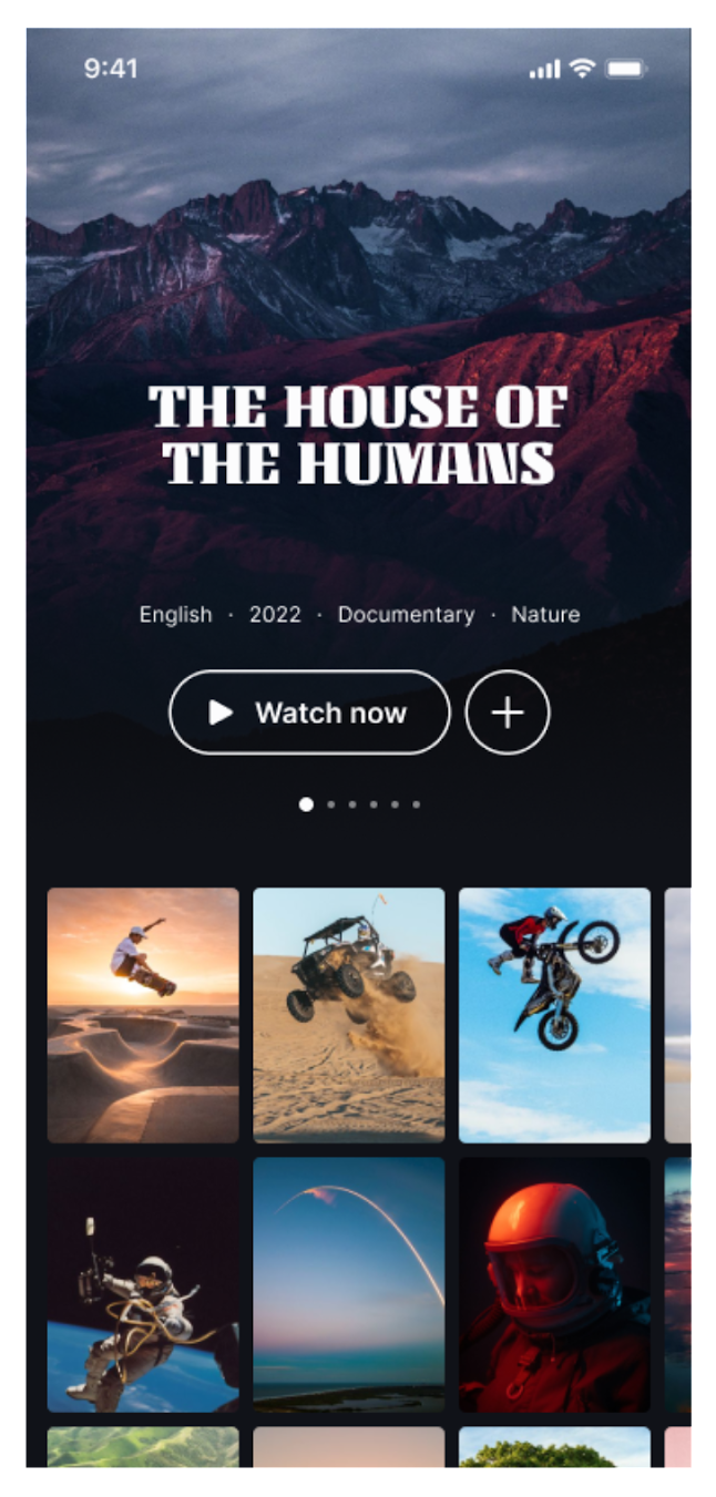
Hotstar is an online video streaming platform that offers a variety of content, including drama, movies, and live sports. It is owned by The Walt Disney Company India and operated by Disney Streaming, both part of Disney Entertainment. Hotstar is one of the dominant streaming services in India, with over 300 million active users.
In their mission to build next generation mobile experience, Internal design team redesigned their mobile app for better user experience and to improve the user retention.
As experts in iOS development, we were engaged to enrich their internal team to make this redesign a reality with sound software development principles.

Challenges
How will you organise fluid design components that are composable, customizable and reusable?
The mobile application was designed with motion design principles. This means, every component will animate in harmony with other components based on the user interations like scroll, swipe and click. Building an iOS mobile application that is interaction rich with reusable components is not a simple task as it would need proper abstraction and well planned component composition.
How will you handle different animations happening at the same time?
Gesture-based animations
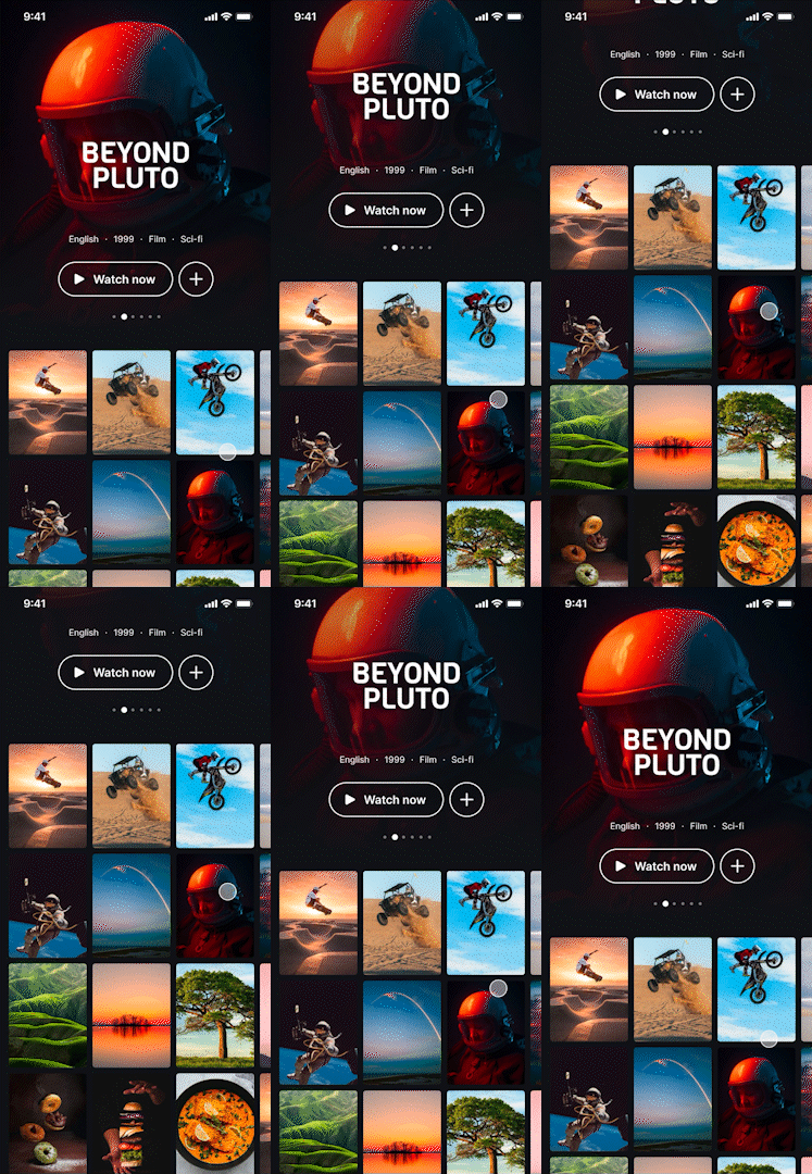
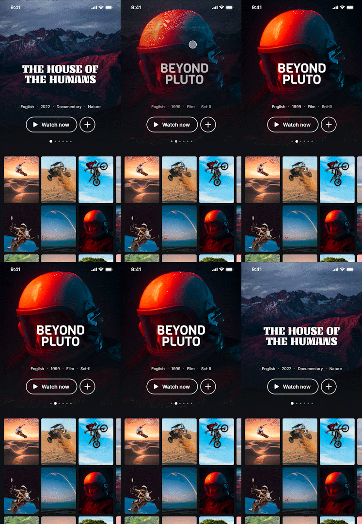
We needed to implement both vertical as well as horizontal animations that could be triggered by a scroll gesture from the user. The type of animation in each direction was different - vertically, we needed a parallax animation, whereas horizontally, we needed a pan animation with crossfading and movement offsets. Apart from the above, we also needed to support a slow panning gesture as well as a fast flick gesture, and also needed to auto-complete the animation when the pan gesture crossed a particular threshold.
Timed animations
Not only did the animations need to work when the user performed a scrolling action, they also needed to run on a fixed timed interval that was determined on the backend. We needed to ensure that the user-triggered and automated animations did not conflict with each other in any way.
Smooth animations
To ensure that the animations were smooth without any perceptible lags or hiccups, we needed to synchronize the animation with the device's refresh rate, whether it was 60hz or 120hz on the latest models. Reversible animations We needed to ensure that the animation could be reversed to the starting position, if the user did not complete the pan gesture fully.
Infinite scrolling
If the user reached the end of the list of items in the masthead on either side, we needed to allow them to loop back to the start or end again.
Solution
Given the multiple requirements and challenges, the solution was not as simple as just using the UIView animateWithDuration APIs to drive the animation. Here’s how we implemented it
UI view hierarchy
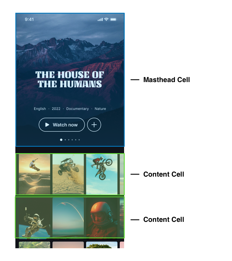
We used a simple UITableView to host the contents of the home page, including the masthead component. UICollectionView was a no-go, because improvements that would allow us to use it for list-like UI, such as compositional layouts, were only introduced in iOS 13. This also meant that we had to use UIKit, and not SwiftUI as that was also an iOS 13 introduction.
Within the table view, each cell contained a separate component, and the masthead component was one such. The masthead itself consisted of a horizontally scrolling collection view.

Implementing the vertical scroll parallax animation
Because the root view was a table view, we were able to listen to UIScrollView delegate methods and obtain the scroll offset using the scrollView:didScroll method. The current scroll offset was broadcast as an event using RxSwift, and was listened to by the masthead component. The component then further broadcast it to the current visible cell of the internal collection view, where we updated the auto layout constraints to move the necessary subviews in the opposite direction of the scroll, giving a parallax effect.
We used RxSwift instead of say NSNotifications, as the former allowed us to expose a type-safe BehaviourSubject containing a CGPoint of the current vertical offset. With Notifications, we would’ve needed to package the CGPoint in an untyped [String: Any] userinfo dictionary, and then cast the value when consuming the notification.

Implementing the user-triggered horizontal animation
The first thing we did to support the custom animation that we wanted is to disable scrolling on the internal collection view, because we simply did not want the default scroll experience.
Instead, we used a separate pan gesture, and manually transformed the collection view cells and its subviews when the gesture updated, to make it look like the collection view was scrolling during the animation.
Whenever the pan gesture updated, we did the following: We stored the “translation” of the pan gesture, aka the distance that the user has moved using the gesture To ensure that the animation happened without any jitters or dropped frames, we used a CADisplayLink to drive it. When a display link is configured and added to the runloop, it gives us a callback everytime the screen is refreshed. In this callback, we calculated the progress of the animation based on the translation stored above. Since this happens on every refresh, no frames are missed out or dropped. We then broadcast the progress to two individual cells - the current cell being animated out, and the next cell being animated in. They update their subviews accordingly - for example, the current cell would animate out the title to the side, and fade out its poster image. The next cell would animate in the title from the side, and fade in its poster.
Once the animation was complete, we then scrolled the collectionview to the new indexPath, albeit without any animation of its own, so that its internal state is up-to-date with what is on screen.

Implementing the automatic horizontal animation
We used a Timer instance to automatically scroll the masthead on a fixed interval, when the user wasn't actively scrolling it.
When the timer got fired, we simply unpaused the display link, allowing it to drive the animation from start to finish. Instead of using a gesture’s translation to calculate progress, we used the display link’s timestamp during each of its callbacks, to determine how much time has elapsed, and then using the animation’s total duration, we arrived at the progress. Once the animation was completed, we scheduled the timer again, so that it can run one more time as needed.
In some cases, we did not want the timer to fire. For example, if the user was performing some other action such as scrolling the tableview, we did not want to distract them with an auto-scrolling masthead. To achieve this, we added the timer to the main runloop using the default mode, as opposed to the common mode. In the default mode, the runloop is blocked by other events on it - in this case pausing the timer. As an extra precaution, we also added a check to prevent it from activating whenever the pan gesture to manually scroll horizontally was active.
Outcome
The redesigned UI of our client’s mobile app with a homepage layout consisting of both parallax vertical animations and a custom horizontal scroll transition is now available on iOS. In this day and age, it is critical for mobile apps to stand out with a polished UX that delights users, and we helped our client achieve just that with our implementation of the Masthead component
_tech
used
